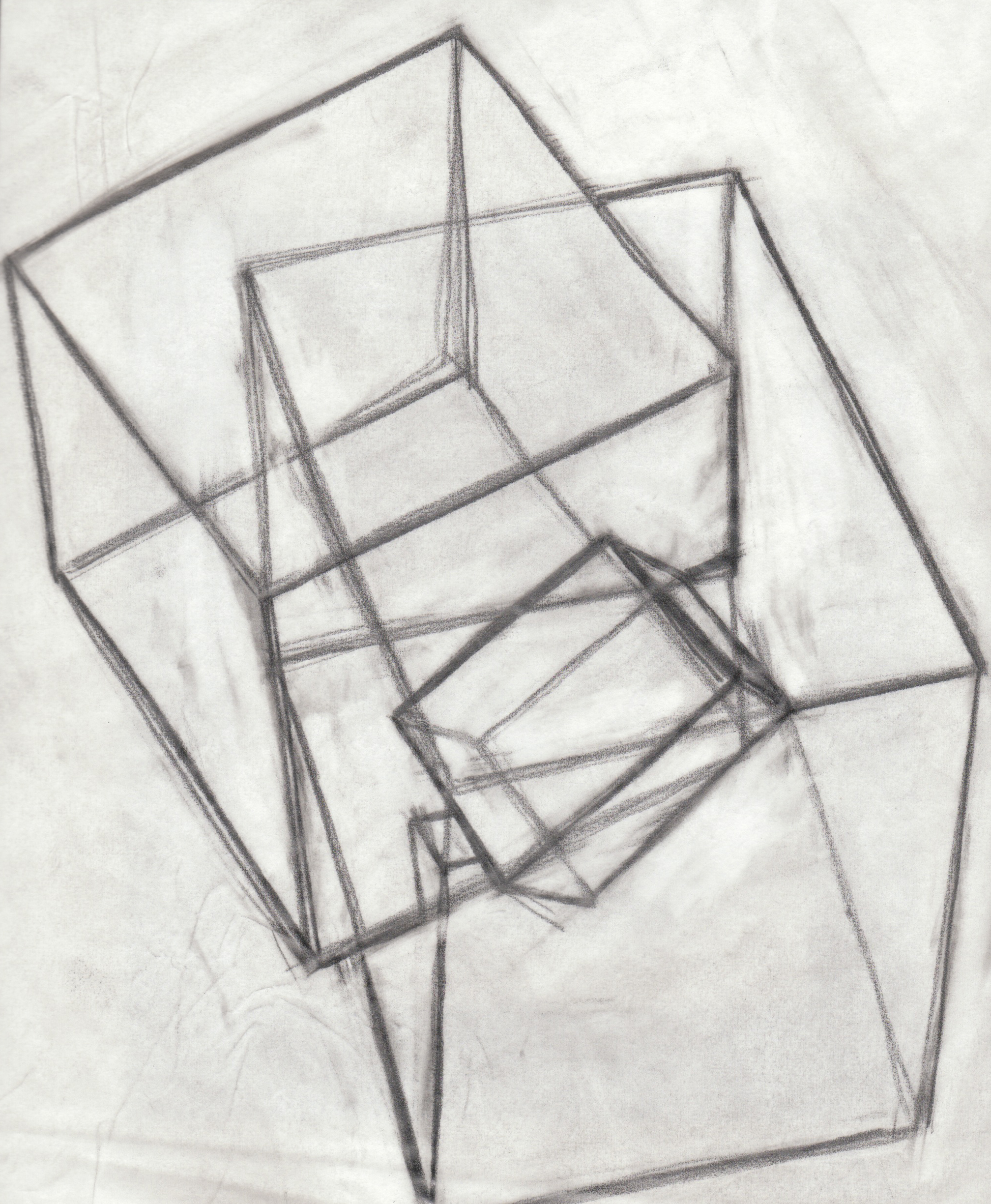
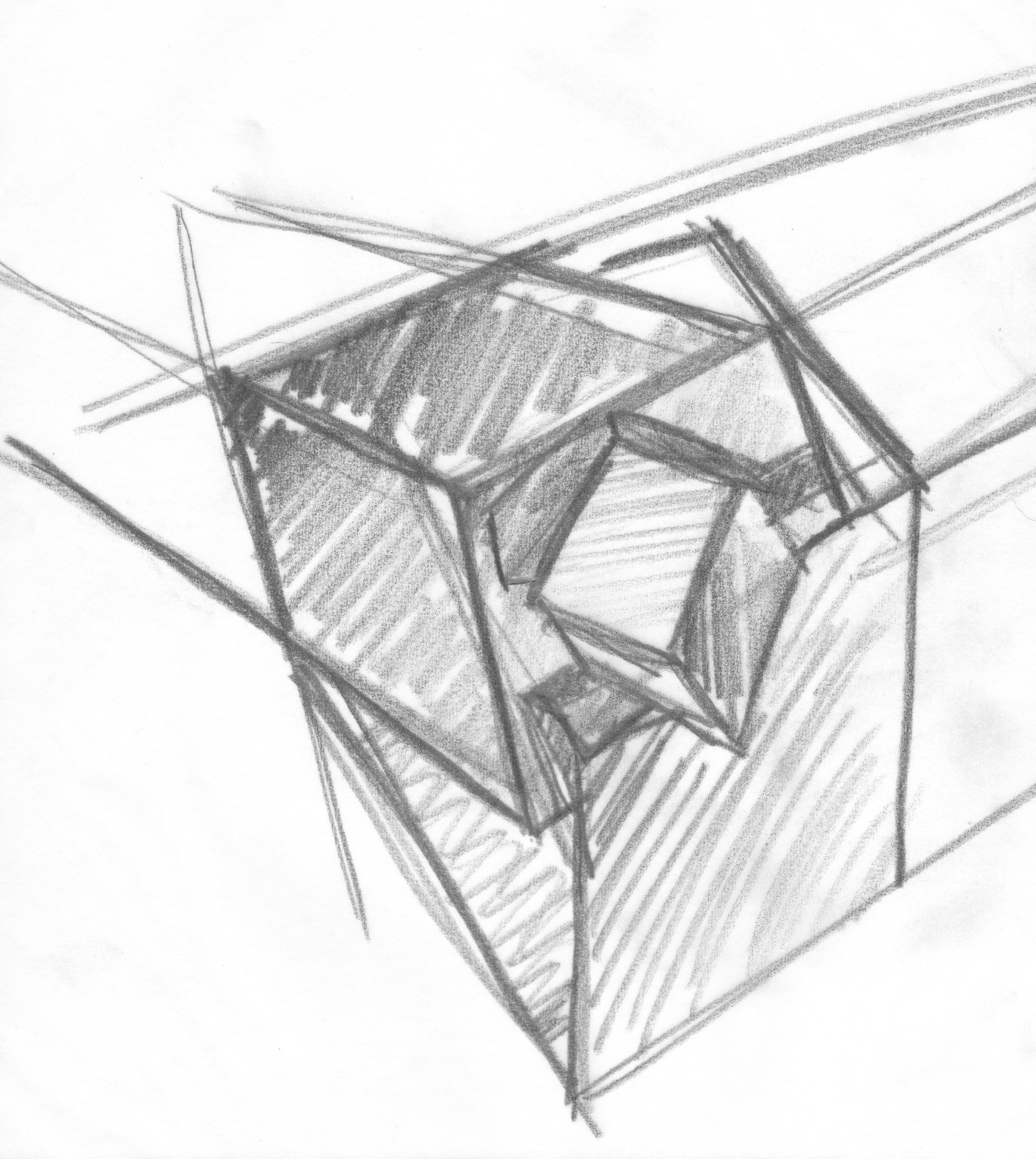
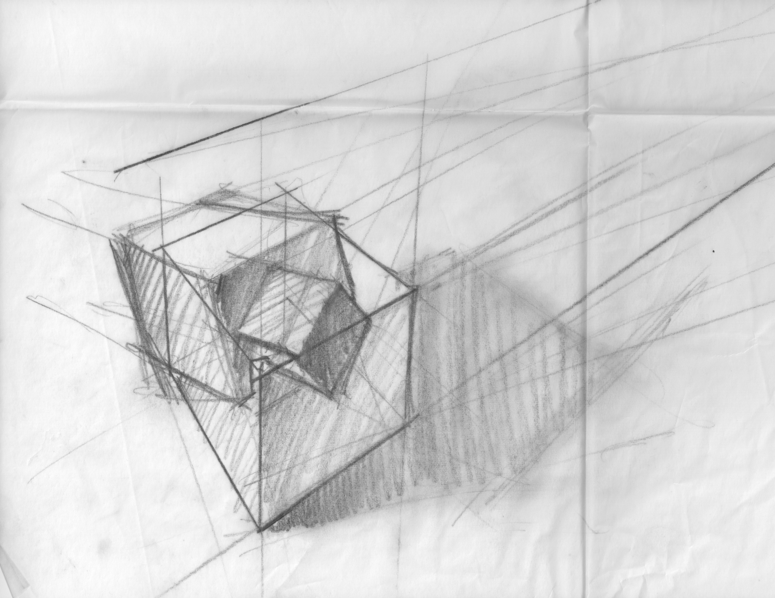
With all its intersecting masses, Pyrite is a particularly challenging object to draw. I still have a long way to go.
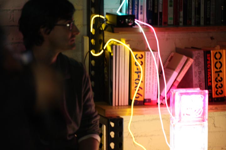
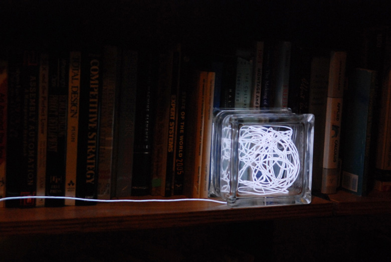
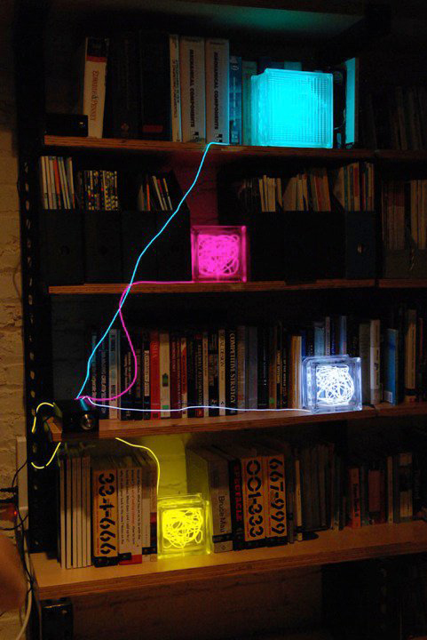
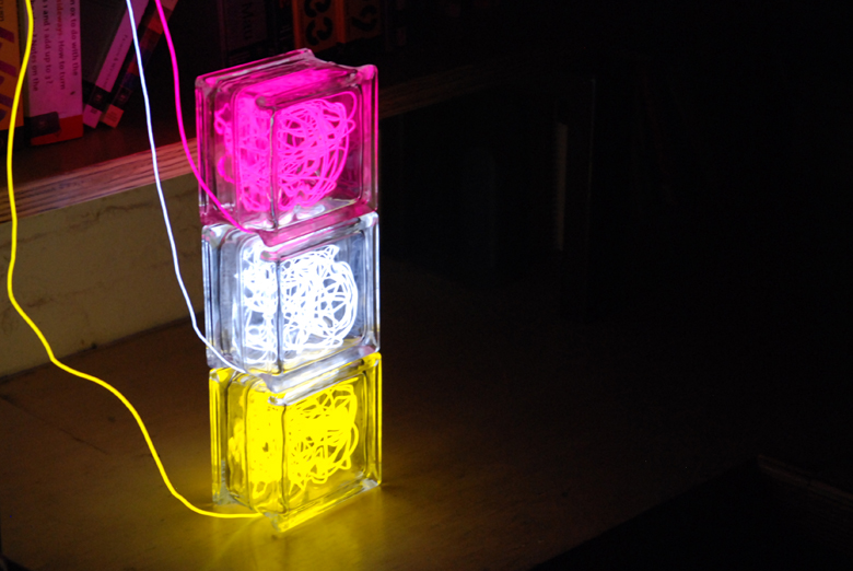
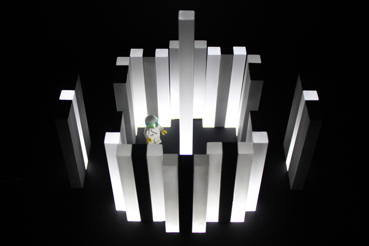
The coolest blacklight ever.
The updated version of these light sculptures took off on fab.com in May 2012. You can learn more and buy them at betablocs.com.
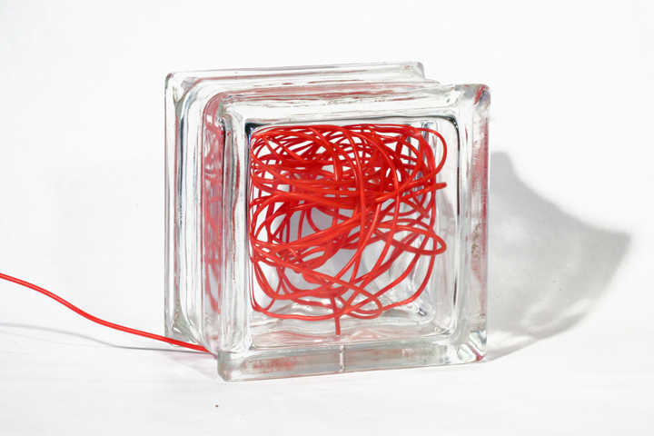
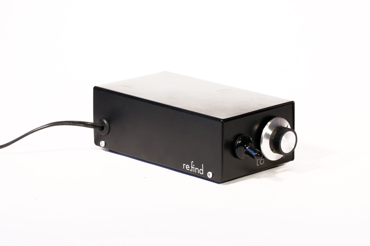
Reclaimed Architectural Glass Block + Electroluminescent Wire + Electronic Controls
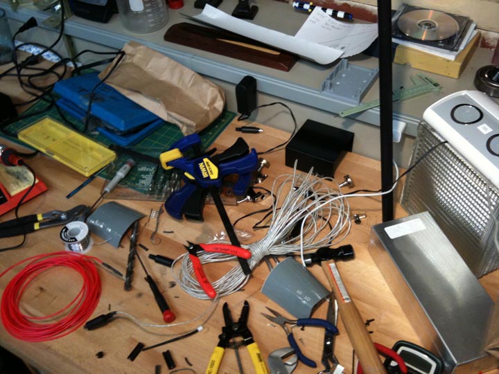
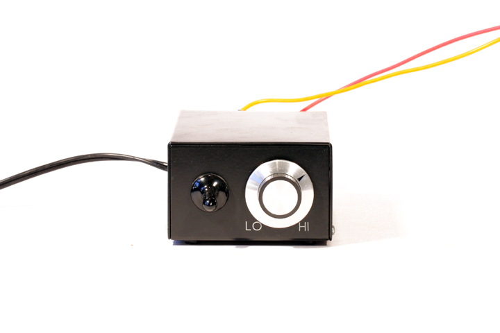
This is one of my favorite projects, created during Bill Burnett's Formgiving class for the Illuminating Object assignment. Modular Beta Blocs were created from reclaimed architectural glass block and electroluminescent wire that plug into a purpose-designed control box. They are dimmable and can be programmed to a respond in various ways to a wide range of external stimuli including ambient light, sound, touch, temperature, humidity, proximity, etc.
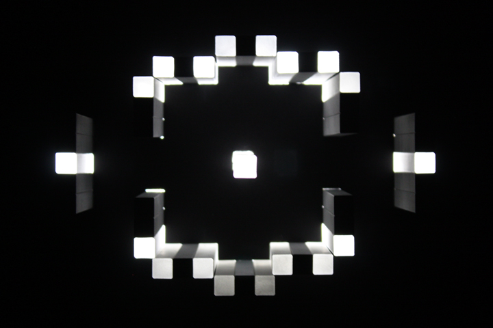
This animated gif shows how a new version responding to sound.
The video below shows the very first prototype responding initially to the sound of bubble wrap popping, then to the vibration caused by me shaking it vigorously.
From a design perspective, I chose to explore the physical principle of Brownian Motion, or the seemingly random movement of particles suspended in a liquid or gas. The 25' - 40' of EL wire are fed carefully into a painstakingly drilled hole in each block. The path of the EL wire is primarily a function of the block's internal volume and features, enabled by only minor aesthetic input during the assembly process.
Pink foam + black foamcore
These studies were completed for Bill Burnett's Formgiving class in the Stanford Graduate Design Program. The composition on the left represents "ordered" whereas the one on the right is "random."
These hand-shaped pink foam models are housed in purpose-built foamcore dioramas. The larger spheres were roughly 3.5" in diameter. Below is a simple stop-motion animation of "ordered," which depicts spherical packing efficiency. Also below are my (very green) concept marker renderings.
Pink foam + black foamcore
These studies were completed for Bill Burnett’s Formgiving class in the Stanford Graduate Design Program. The composition on the left represents “open” whereas the one on the right is “closed.”
These hand-shaped pink foam models are pictured on a purpose-built foamcore stage. The cylinders are roughly 3.5″ in diameter by 9" tall.
Sandblasted aluminum, acrylic, foamcore + LED
For this project, I envisioned a calm public space nestled along a fjord in Iceland. Although I originally planned to create a grotto-like ceiling and stepped walls for this piece, once I placed the main walls, I was taken by the simplicity of it. The floor plan, however unintentionally, resembles a Kalachakra mandala.
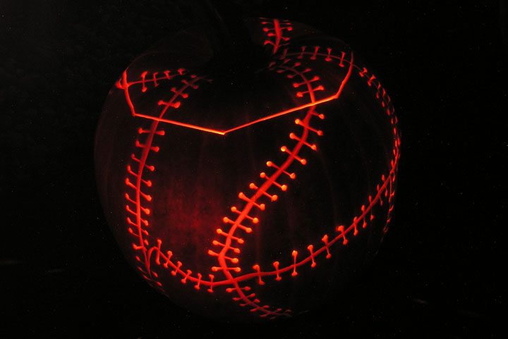
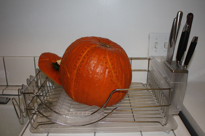
Pumpkin + Candle
Halloween pumpkin carving is a long-standing tradition at the Stanford Design Program. First year graduate students carve one (or more) as part of their ART 60 class and everyone takes their creations to professor emeritus Matt Kahn's house for the annual party.
The unique look of this pumpkin was crafted through various techniques. The translucent areas were carved out to an airy thinness to illuminte the texture of the pumpkin's flesh. The scars and sutures were carefully cut through only the rind, while the suture holes were punctured clean through with a cordless drill.
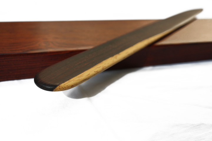
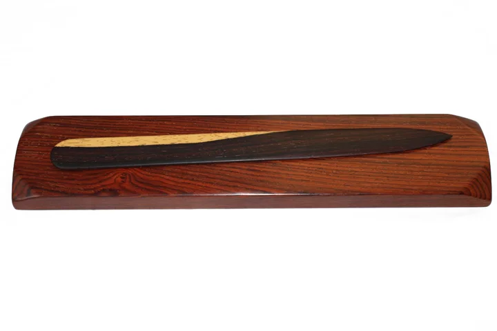
Cocobolo.
In the age of email, receiving a handwritten letter is particularly delightful. I crafted this cocobolo letter opener to heighten the anticipation and tactile aspects of that experience.
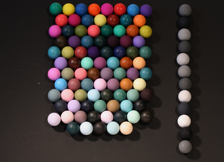
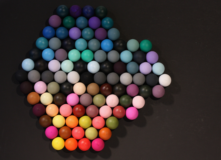
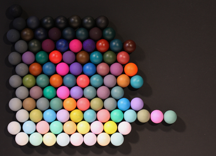
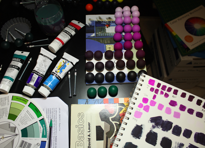
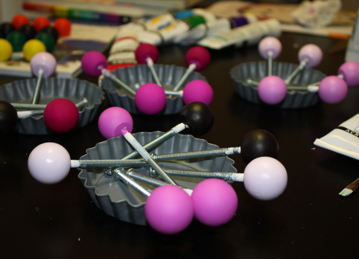
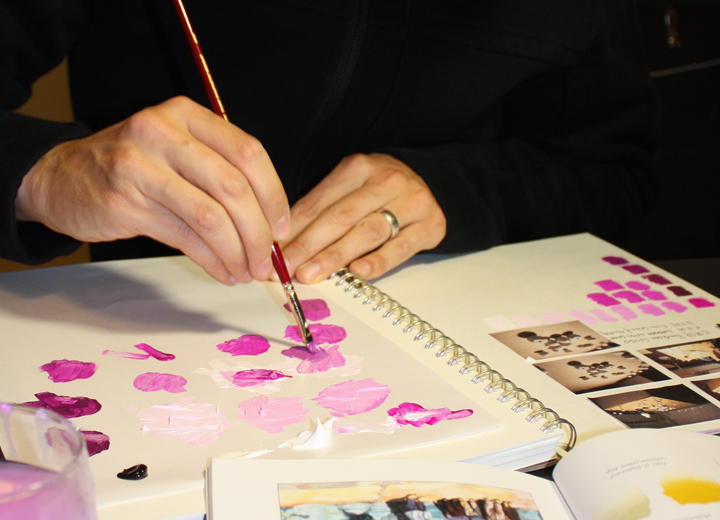
Stanford's ARTSTUDIO60 class is a contemporary take on The Basic Course at the Bauhaus as taught by Johannes Itten. It is a rite of passage in the Stanford Design Program. 300 Objects, is essentially a color theory exercise in which students paint 300 small objects and arrange them in three different patterns using 100 objects per pattern. The goal is to give students a more intuitive understanding of color and a language in which to communicate it.
This is a concept piece playing with the subjectivity of design fads/trends. Is it any stranger than a claw footed tub? I really need to make this.
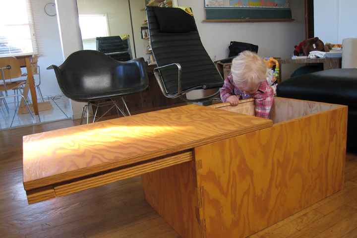
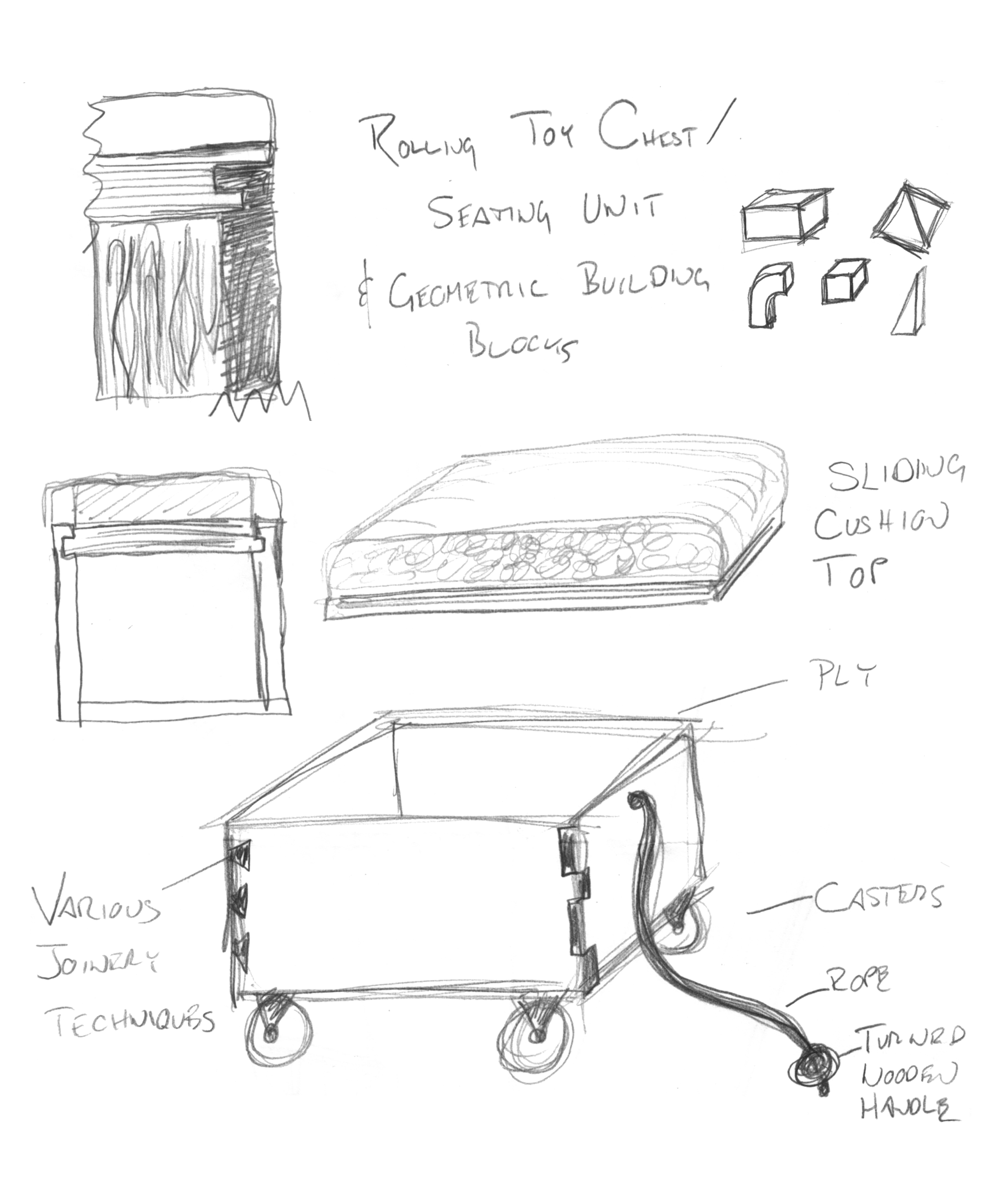
Marine grade fir plywood finished with danish oil.
This storage piece was given to a friend celebrating the birth of his first child. Constructed of marine grade plywood, it features a sliding, cantilevered top and asymmetrical joinery.
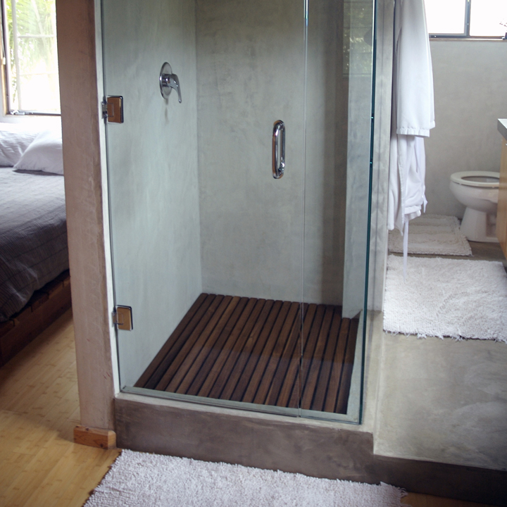
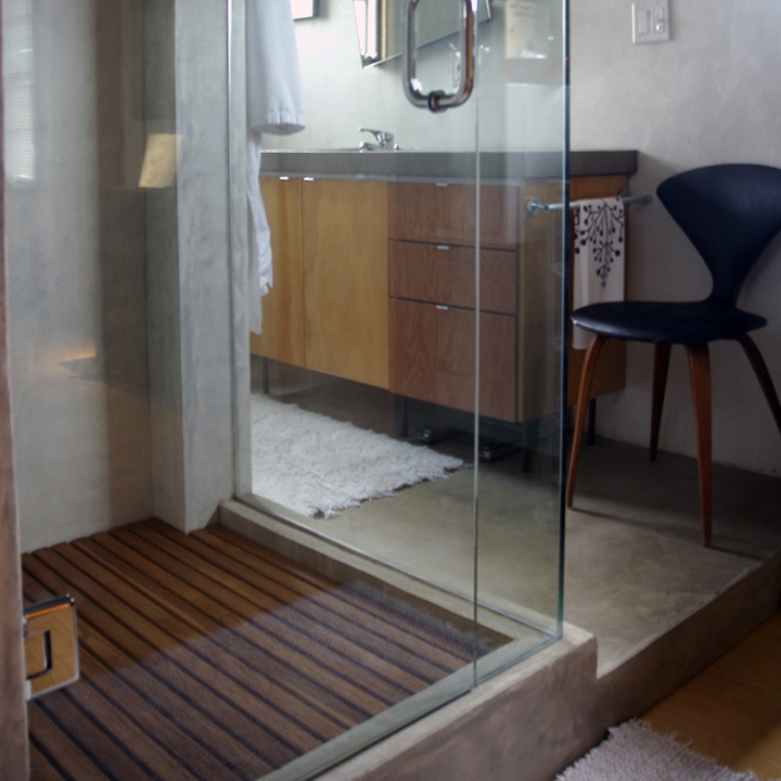
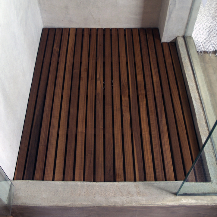
Walnut finished with tung oil and satin polyurethane.
Designed to add warmth to my concrete and glass shower. It features quarter rounded edges, integrated drainage channels and countersunk stainless steel screws.
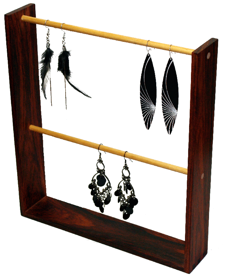
Reclaimed Cocobolo and Maple Dowels
One in series of earring stands created for a Los Angeles-based jewelry designer. Simple finger joint and dowel construction was used to keep viewers focused on the jewelry and complement their design.
Galvanized + Stainless Steel
An ad hoc assembly of reclaimed heating ventilation components.
FSC Redwood and Marine Hardware
I built this bed in case California fell into the Pacific Ocean. Designed according to floating dock specifications, replete with load-bearing cleats.
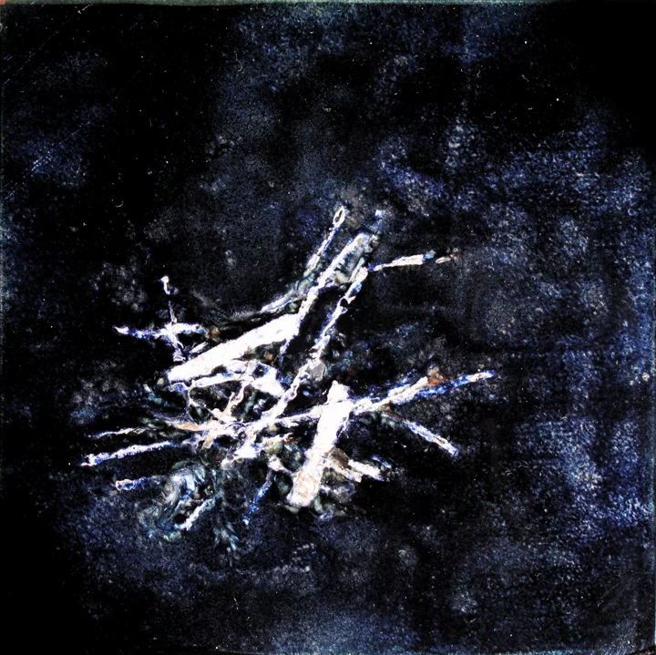
Hand-hammered silver, copper tile and glass enamel powder.
Enameling was one of my mother's favorite arts and I learned it from her. This mixed media piece features multiple alternating layers of translucent and opaque enamel interlaced with hand-hammered silver ribbon
This piece was inspired by my study of the crystallization "Widmanstätten" patterns found in certain types of ferrous meteorites like the one below.